Subscribe to
Follow
Hello

Welcome! I am Kathy McGraw of KMG, a graphic designer, east coast gal transplanted to beautiful southern California/ San Diego. This is some of what inspires me. I like to think of it as a mix of west coast bohemian and east coast folk meets Mumbai meets Paris. I'm drawn to eclectic hand done looks with lots of prints and texture, particularly Indian prints and French style. I love branding, packaging, hand lettering, hand printed designs, block printing, screen printing, letterpress and illustration...

Search


NEWSLETTER SIGNUP

* indicates required


Entries in Branding (14)

Monday
Mar192012

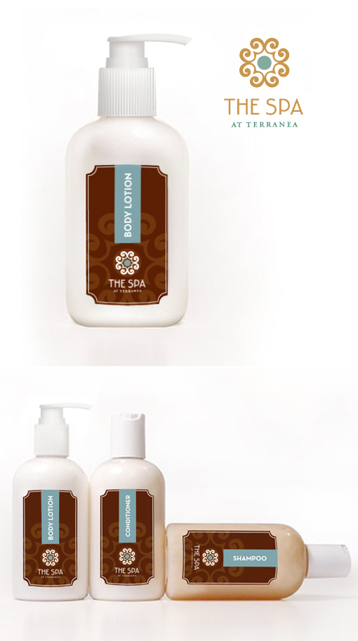
PACKAGING: The Spa at Terranea


I had created this logo design and this packaging a while back for "The Spa at Terranea" while I worked at Van Vechten Creative, but I never had images to show it off... So I thought I'd show it now. I think it came out quit lovely... I am thankful that I had the opportunity to work on this project. Terranea is a beautiful resort in Palos Verdes, California just south of Los Angeles.

Thursday
Mar082012

BRANDING SOCIAL MEDIA: FRESHLY HATCHED

I recently had the pleasure of designing some social media branding for Freshly Hatched Studio: a logo, Twitter and Facebook elements, and Wordpress blog design... Freshly Hatched Studio is going to be lifestyle blog about arts & crafts, raising a family and cooking.

Wednesday
Jan252012

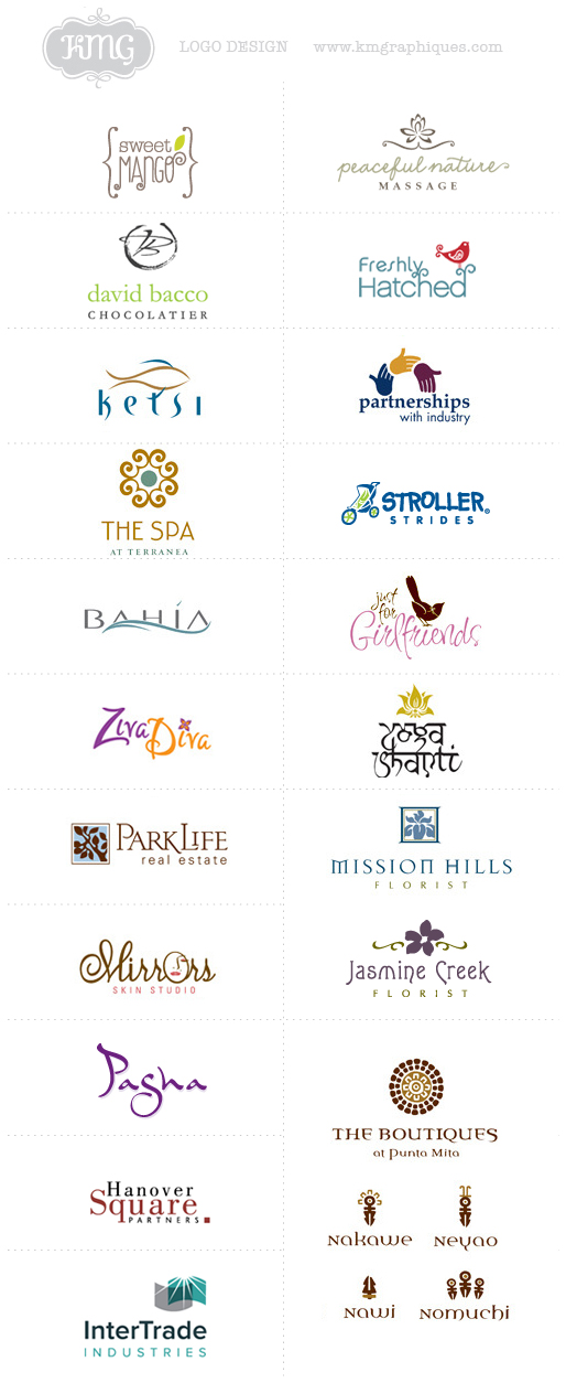
KMG: Logo Design

I compiled some of the logos that I have done. I've been fortunate to have the opportunity to work with some great clients. Hope you like them!

Wednesday
Oct052011

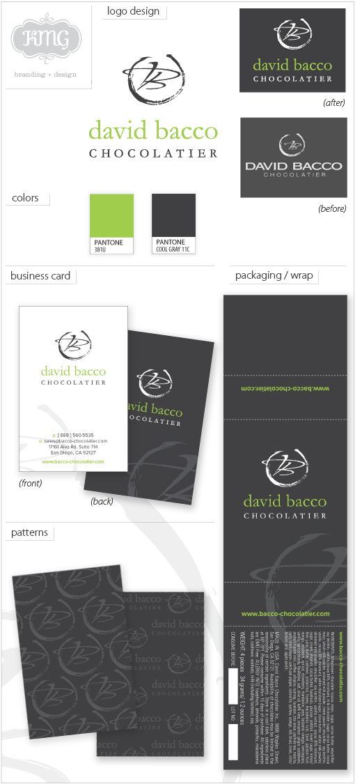
KMG BRANDING: David Bacco Chocolatier


David Bacco Chocolatier, creator of exclusive artisanal and hand-crafted chocolates approached KMG to redesign their existing logo and to create new branding for their company. KMG updated their old logo using more contemporary and elegant fonts and reworked their existing mark to make more of an elegant statement. KMG also designed beautiful business cards, and packaging wraps for their boxes of chocolates and created patterns that could be used for wrapping product.

Monday
Aug222011

BRANDING AND CROWDSOURCING

Hundreds of websites run contests for everything from logos to brochures designs. All you have to do is write a description of what you want, post an amount you are willing to pay for it. An online company will then act as a go between you and designers. Designers from around the world submit their entries in the hope that their work will be chosen and they will win the money. If you select one of the designs as a winner, that specific designer, and only that designer, gets paid for their work. If no design is selected, no one gets compensated. This practice is now called 'crowdsourcing'.

WHAT IS CROWDSOURCING IN RELATION TO LOGO DESIGN & BRANDING? At first, it’s easy to understand how crowdsourcing might have an appeal. It doesn’t cost much and it tends to have quick results. This is what people tend to see and why it has grown in popularity. There are some things that a business cannot crowdsource to create its brand: like its name, culture, or point of view. There is value in hiring a talented design firm that is well versed to create a brand for your company. At face value, crowdsourcing might have that immediate appeal but in the end the costs are damaging to your company’s success. Why would you trust your new identity to DIY designers who don’t understand your brand, business strategy or core values? The reason companies spend so much time and effort to create a unique brand is because it’s essential to the longevity of their business.” To build a bond with the consumer, you really need to have insight into who they are and what compels them. Don't waste a few hundred dollars and get something that won't work.  Make a good investment on your brand identity.

CROWDSOURCING IS A REALLY BAD IDEA FOR YOUR BUSINESS. It’s not wrong because it’s cheap. It’s wrong because it lacks value and doesn’t help a business with its brand. A logo is not a brand. The brand makes a company mean something to its audience. A logo is a single element that goes into making a brand. It’s part among many things to make up a company’s story. A brand cannot be built from one or two statements that ill-informed designers will use to set off in every direction to create a logo.

THE QUALITY OF CROWDSOURCING TENDS TO BE LOW. The quality of the final designs of crowdsourcing contests is mostly determined by the quality of talent, the contest set up and how it is well it is managed. Crowdsourcing designers tend to have less training in the fundamentals of graphic design, which often times result in logos based on stylized trends and fads with nothing to do with your company’s core values. Most of the people that participate in crowdsource work are students looking to increase their portfolio or DIY hobbyists self-taught on Photoshop without ability and experience.

RESULTS AND MOTIVATION GO TOGETHER. Designers are like other people and are motivated by compensation, respect, and a sense of being part of a team. The relationship between a crowdsourcing client and a crowd source designer is vague and has no underlying motivation. Crowdsourced designers are not vested in the success of your company. Hundreds of people are working for free, from countries all over the world in the hopes that they might get a few hundred dollars from a contest that you posted. Without proper pay, designers don't have a lot of time to spend creating custom work that will connect with your consumer and target market. Instead, what you get is work that has been submitted that is recycled that has been rejected by a 'real' paying client. Is that the level of talent that you want working on your logo and brand? There are many well-documented cases in which work that was submitted violated trademarks, copied logos from well known designers.

GREAT LOGOS ARE WELL RESEARCHED AND BUILT ON STRATEGY. Brand identity has to connect emotionally with your consumer and target market. That doesn’t happen from a just a pretty logo. That comes from really knowing the consumer and the company. It takes lengthy discussions and research to get feel for an industry and company. Who is making sure that your crowdsourced logo will work on a strategic level? Who is making sure the design will compel consumers to choose you instead of the competition? Most likely you will get a logo that won’t have any longevity of a well-designed and thought out logo that has your overall branding in mind from a skilled designer/firm. 


Wednesday
Aug172011

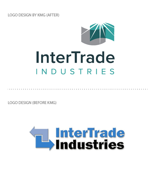
KMG LOGO DESIGN: Intertrade Industries

Intertrade Industries, a thermoforming plastics company in Huntington Beach, California contacted KMG to design a new logo to update and re-brand their existing image. They needed a more contemporary feeling that went with their market, with a font treatment that was more technological. Their original logo was ambiguous and didn’t reflect the plastics industry and what they did. Intertrade Industries also needed to update their outdated color scheme. KMG choose a clean contemporary sans serif font and designed an icon that had the feeling of "plastics" but also had "energy" and conveyed the concept of an idea being introduced to go along with Intertrade's tagline of  “Imagine. Design. Deliver.”  The company wasn’t ready to give up a blue color scheme, so KMG picked two new industrial and more contemporary blues.
Thursday
Jul212011

BRANDING: Choosing Fonts For Your Brand 

Branding isn’t just for large companies. Small and medium sized businesses benefit from branding too. Branding doesn’t stop with the creation of a company’s name. That’s just the beginning. A company’s brand should consist of multiple elements: it’s identity, as well as it’s messaging. A company’s brand must be so unique that it can easily be recognized by the consumer and separated from all other competing brands.

The identity is the image of the brand and includes: the logo, a color palette, and the fonts. The selected fonts for a company’s logo and messaging are essential and if used correctly will give credibility to the brand. They will make a company’s brand distinct. Fonts have personalities, and like a company’s logo, they should support the company’s message. The company’s fonts should match the company’s image and personality. Is the company serious, playful, or formal? The font selection should reflect this e.g. conservative businesses shouldn’t pick loud and complicated fonts. Another thing to consider is that a company’s brand should also match the personality and preferences of its clients.

Companies should be consistent in their font use for all their marketing and promotional materials. All marketing materials should have a limited number of font families (a font family includes a normal, bold and italic variation of a particular font). Using more than three font families is excessive and may come across as unprofessional.

Consider specific company fonts for:

  • The logo: This font should be unique and interesting and should not be one of the default fonts installed with Windows. Logos may use two or three different fonts. In this case a company might want to use one of the fonts as a secondary font too.

  • A secondary font: A unique and interesting font for headlines, sub-headlines, taglines, special text graphics, captions, and pull quotes. Consider using a logo font as a secondary font. 

  • A tertiary font: A highly legible font like a serif font for mid length texts and long printed documents. Typically printed materials are more easily read if they are in a serif font rather than a sans-serif font. Serif fonts have little those tiny little "feet," at the ends of their letters. Examples include Times, Palatino, and Garamond. Tertiary sans-serif fonts may be used for shorter printed documents. In Sans-serif fonts those little feet are missing and they look more clean and modern. "Sans" means “without”. Some of the more common san serif fonts are Arial, Verdana, Tahoma, and Helvetica.

  • Online fonts: San serif text on a computer monitor for websites, emails, and HTML newsletters is easier to read than serif. Online fonts should be limited by what a user might have installed on their computer and most likely will be Verdana, Arial, Tahoma, or Trebuchet MS. Otherwise the text may default to whatever is selected by the user’s browser. Serif fonts can be used on websites; but may be better as headlines and subheadings. These include Times, Times New Roman, and Georgia.

Things to consider in choosing a company's font:

Make sure that the font is legible in large and small size formats, faxed, and in color as well as black and white. The company should have the rights to it’s fonts and that they can be easily installed on all it’s computers. Typically companies settle and stay with the default Microsoft’s Office Suite fonts: Times and Arial. Using these fonts doesn’t create much of a visual brand difference between a company and it's competitors. Font types are usually Post Script, True Type, or Open Type. Post Script fonts are an industry standard for professional printers. They are available for both Macintosh computers and PCs as different formats cannot be shared between machines. True Type fonts are found on PCs and do not print as well as Postscript fonts. A company might want to consider purchasing the newer Open Type fonts, which are cross-platform Mac and PC compatible.

Thursday
Apr142011

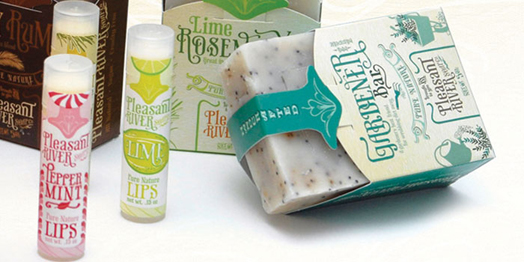
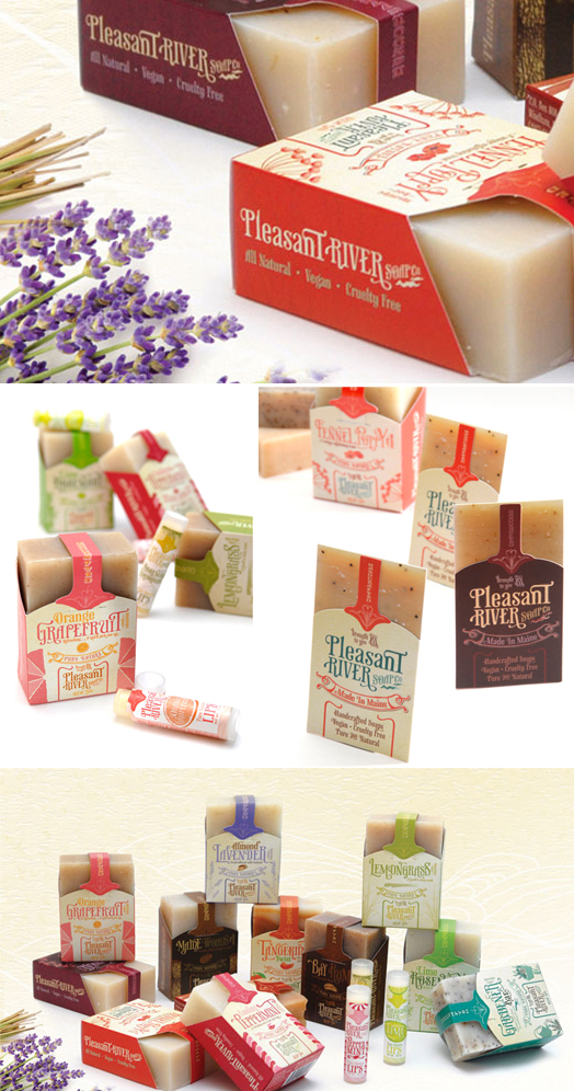
PACKAGING LOVE: Pleasant River Soap


Loving the vintage inspired Pleasant River Soap Packaging for hand crafted soap, as seen on the Dieline. Designed by Art Director: Taja Dockendorf, and Senior Designer: Sara Rosario at Pulp + Wire were vintage inspired in their designs. Packaging was printed with recycled papers and soy inks.

Friday
Feb252011

BRANDING: Curly Girl Design

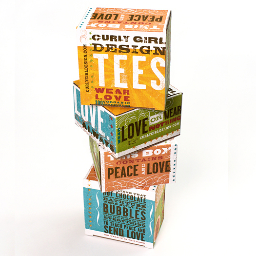
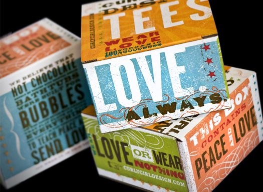
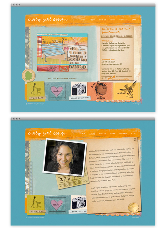
Really cute and fun branding by the incredible Mattson Creative/ Ty Mattson for Curly Girl Design/ Leigh Standley.
 

Monday
Feb212011

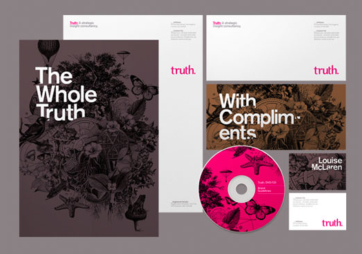
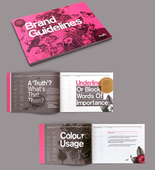
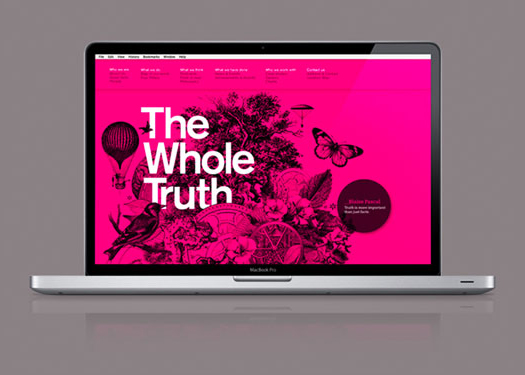
BRANDING: Truth

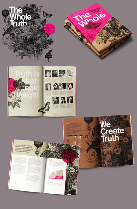
Really beautiful branding as see on designworklife by London’s Socio Design for Truth. Using excit­ing col­ors, Socio Design devel­oped the branding elements and branding guide­lines. 

Friday
Feb182011

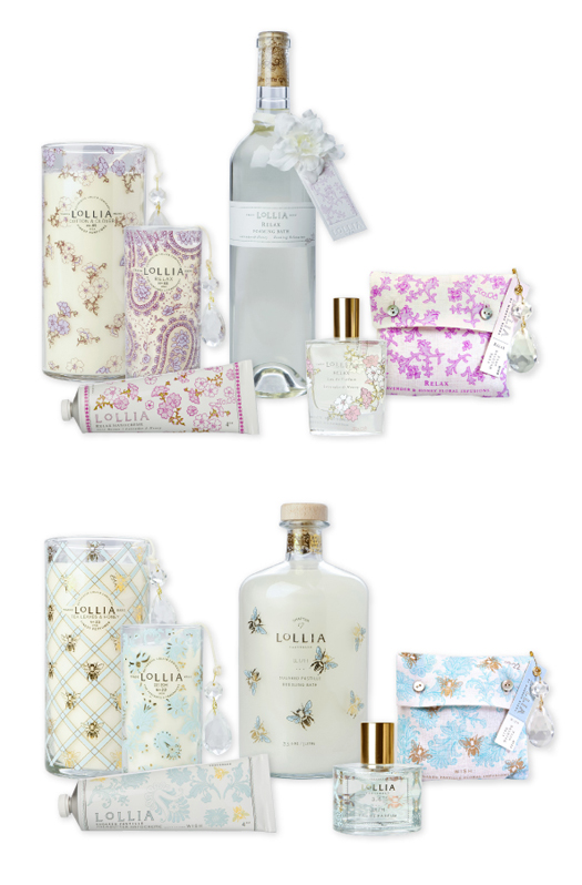
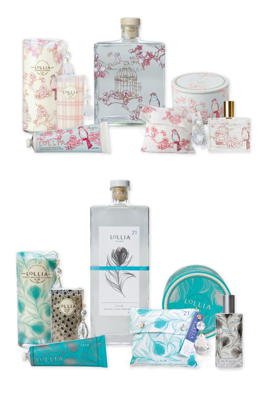
BRAND LOVE: Lollia

Lollia, fragrances, lotions, bath and body products, candles etc… is another amazing brand by Margot Elena. Lollia has a broad range of beautiful mix and match pattern designs that were inspired by warm, soft, and sophisticated textiles. 
 

Friday
Feb182011

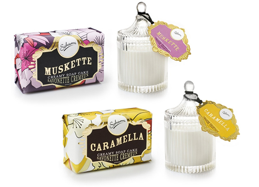
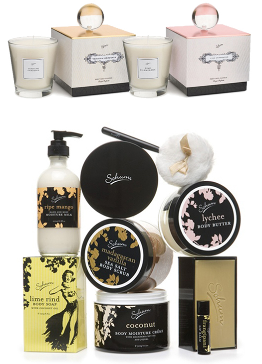
PACKAGING DESIGN: Sohum Cosmetics

Absolutely gorgeous vintage inspired packaging from Sohum Cosmetics as seen on NabeFabric and the Dieline.


Wednesday
Feb162011

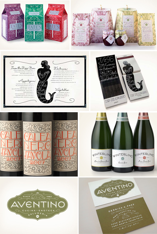
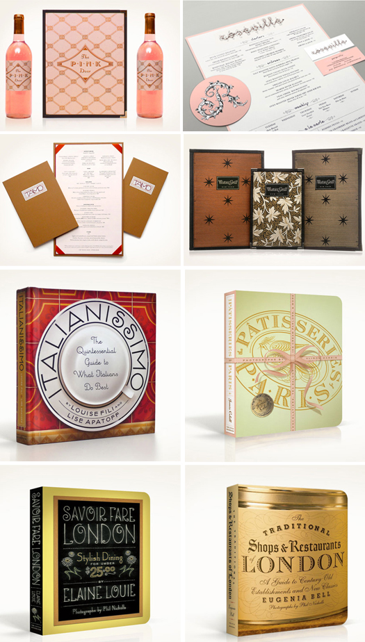
DESIGN GREAT: Louise Fili

One of the all time greats of packaging design and one of my great design loves is award winning designer Louise Fili, president and founder of Louise Fili Limited. I don't even feel worthy enough to post about her. I wanted to show some of the work from her studio and why she is so inspirational. Louise has designed over 200 book covers and received has received awards from every major design competition. She taught graphic design and typography and her work is in the permanent collections of the Library of Congress, the Cooper Hewitt Museum, and the Musee des Arts Decoratifs. 

Saturday
Feb052011

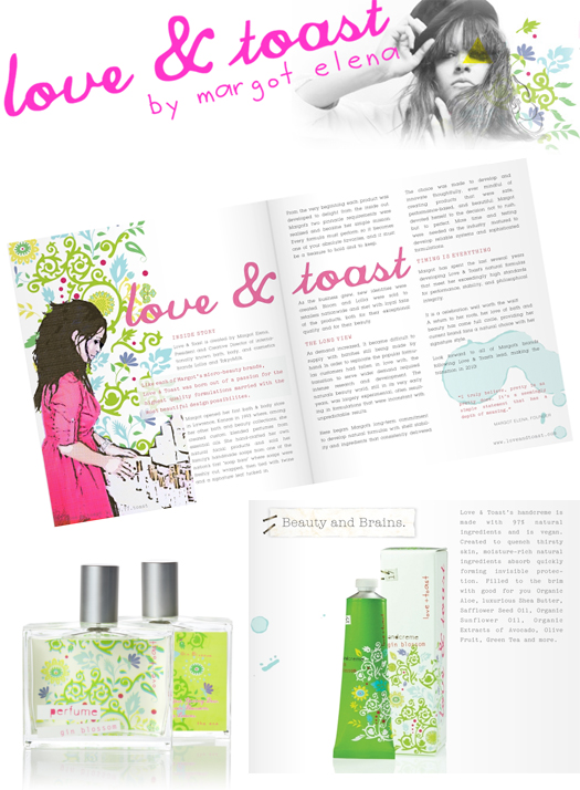
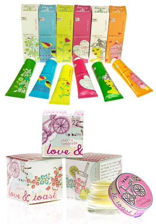
BRAND LOVE: Love & Toast

I originally saw this packaging for Love & Toast on the blog the Dieline. Love & Toast is a brand by Margot Elena who has been praised by her detailed approach to the creative process, and her amazing ability to develop beautifully designed and commercially successful brands. Margot Elena also developed the very successful brands Lollia and TokyoMilk. Love & Toast is Margot Elenas' natural line. She refers to it as “Brit Pop Folk Art" from which she drew from Japanese design and also has a feel of Swedish iconography…